Data visualization is the craft of communicating information, visually. As a former teacher and hobbyist graphic/web designer, designing thoughtful visualizations to communicate the often-obtuse results of research for broad audiences is one of my favorite parts of the process. I believe everyone deserves access to the insights of modern research, and it’s our responsibility as researchers to facilitate that access.
Below, you’ll find links to several interactive visualizations I’ve designed and developed that strive to make dense, complex research insights more approachable and salient to the public. My primary goal with these is always to empower the user to understand what they’re seeing and explore what matters most to them – click through the links to explore for yourself!
I’m always learning, and would love to hear reactions and feedback as I continue to build these skills! If you see something that strikes you or have ideas for how these visualization formats could be used in other contexts, don’t hesitate to get in touch.
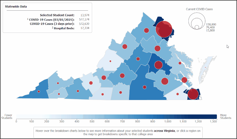
COVID-19 Health Workforce Recruiting Dashboard (April, 2020). Animated preview below.
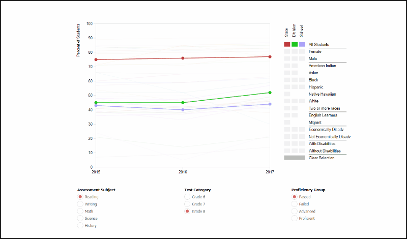
Revisualizing K-12 Student Achievement Data (July, 2019). Animated preview below.
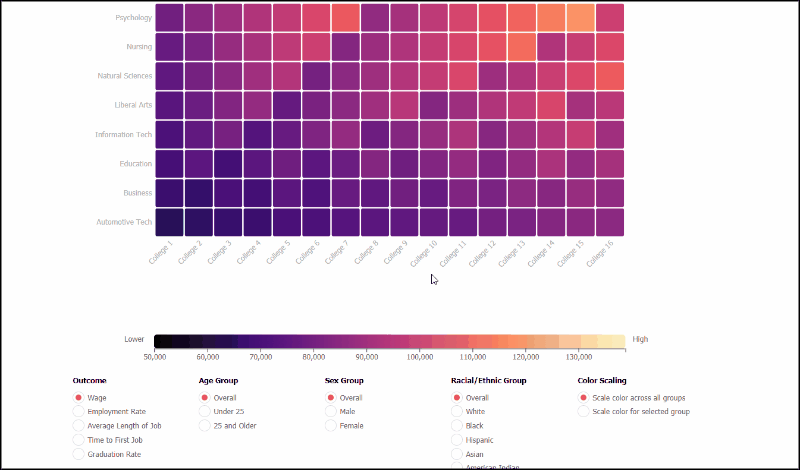
Revisualizing the Labor Market Outcomes of Community College Graduates (May, 2019). Animated preview below.